When you install the Turn Off the Lights browser extension for the first time, more web browsers hide the browser extension icon in a hidden menu. For example in the most used Google Chrome web browser, but also in the Opera web browser. So, you as a user can be confused if you did install the Chrome extension well or not. Because you did not see the gray lamp icon in your toolbar. No need to worry, as it is a user interface update from the Chromium team (= the team that builds the Google Chrome web browser). Here a quote from Google for the reason why the simplified the user interface.
“Our goal with this new UI is to make it easier for users to see what extensions can access their data,”
Explained by the Chromium Extensions advocate Simeon Vincent in a post to the Chromium extensions forum in May 2020
Here an overview of where you can find your Turn Off the Lights gray lamp for each of your favorite web browsers. And with the steps on how you can get the extension icon visible in your web browser toolbar:
Where is my gray lamp icon?
1. Google Chrome
In the Google Chrome version 84 and higher (Windows, Mac, Linux), all the newly installed Chrome extensions will be hidden by default. All installed Chrome extensions will be visible in a list, that in this new “puzzle” icon you will see in your toolbar. The puzzle piece icon called the Chrome Extension Toolbar menu. And when you click on this button, you will see an overview of all your installed Chrome extensions. That includes the Chrome extension icon, name, pin icon, and the 3 dots icon to open the context menu of that Chrome extension.
How to get the gray lamp visible in my Chrome toolbar?
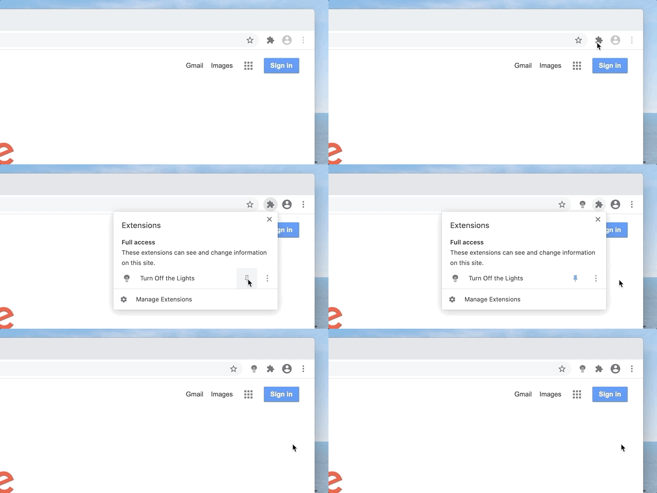
- Click on the puzzle icon in your Chrome toolbar
- A panel shows up, and search for the Chrome extension “Turn Off the Lights”. Next, click on the pin icon
- Now it will add the gray lamp button back in your Chrome web browser toolbar. So you can dim the web page with a single click
2. Opera
Also, here at the latest Opera web browser (Windows, Mac, Linux) will it hide all the Opera extensions as default. To get all your installed Opera extensions, you must click on the “box” icon in your Opera toolbar.
How to get the gray lamp button visible in my Opera toolbar?
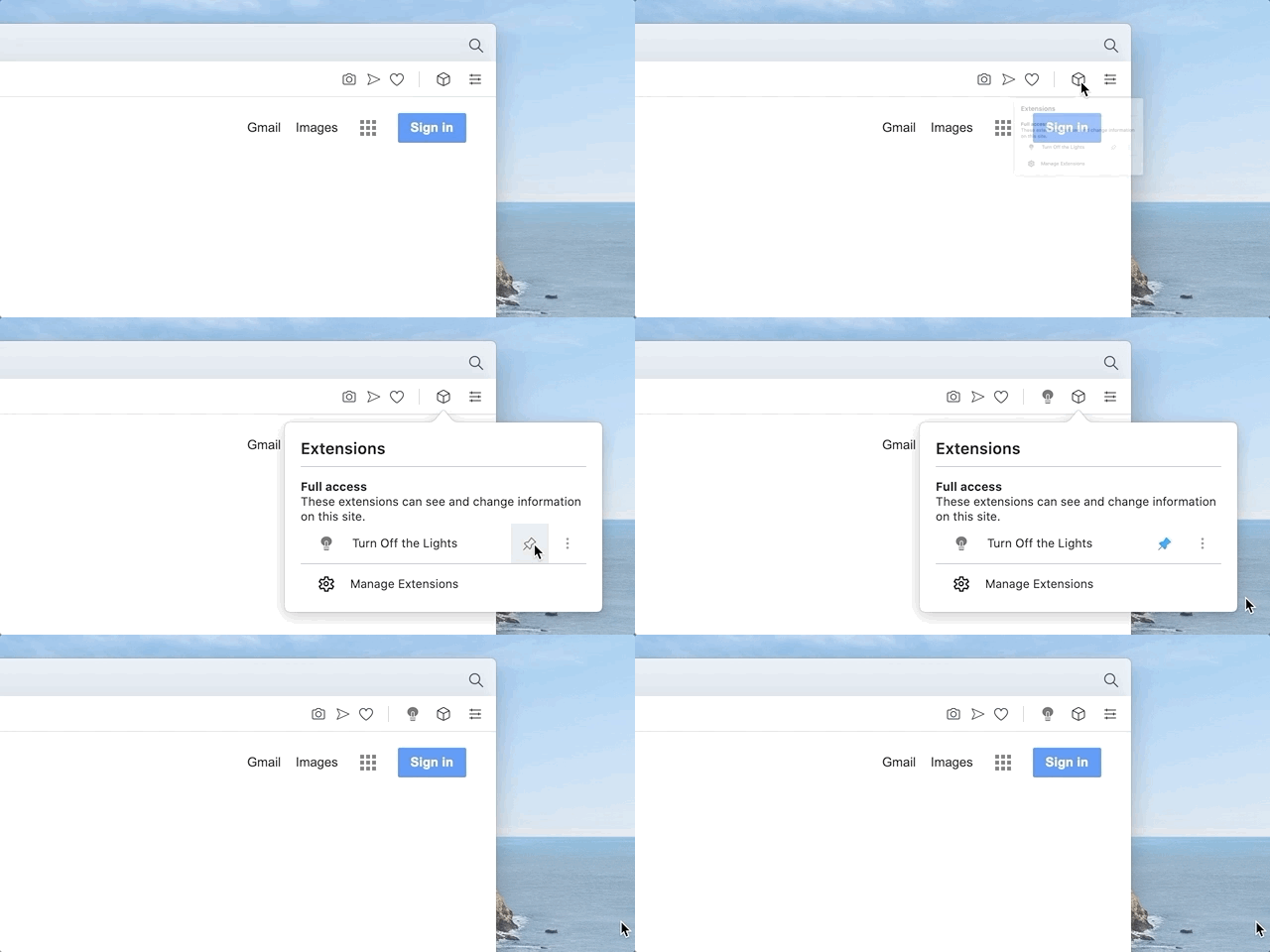
When you click now on the pin icon, it will add the gray lamp button back in your Opera web browser. So you can dim the web page with a single click.
3. Microsoft Edge
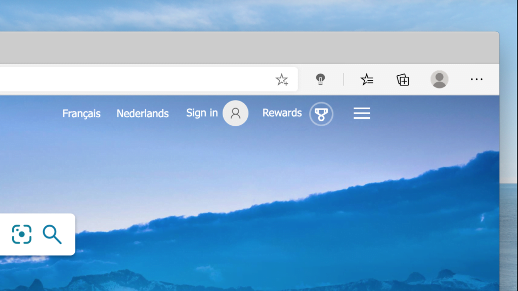
In the Microsoft Edge web browser (Windows, Mac), you will see the extension icon directly in your toolbar when you install a new Edge extension.
4. Apple Safari
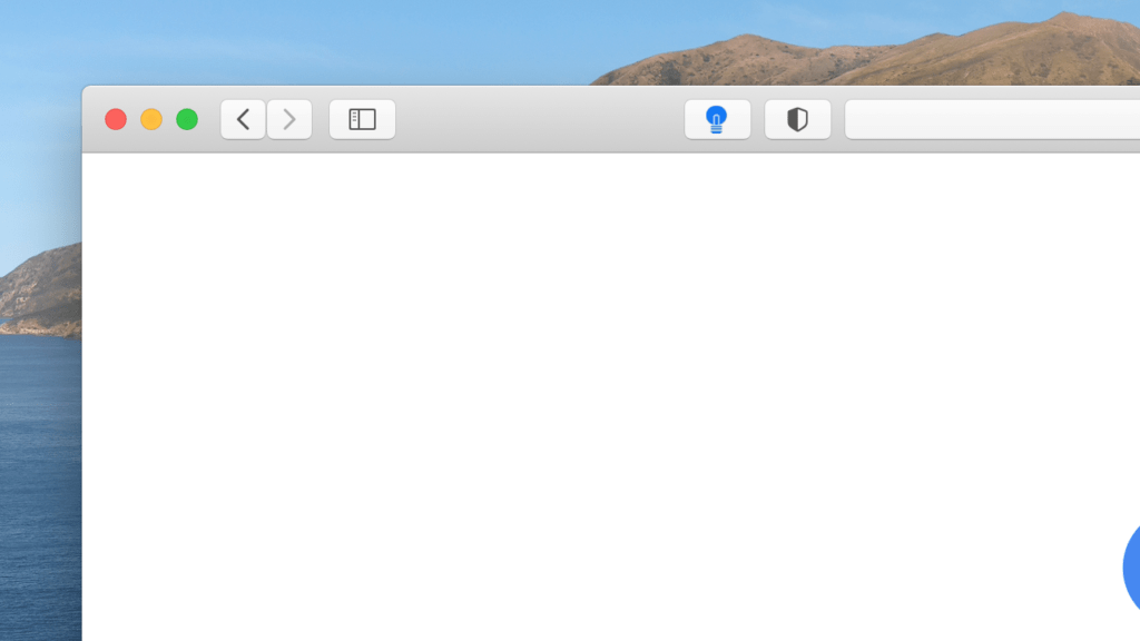
In the latest Apple Safari web browser (only for macOS users) you will see this Safari extension icon always in your toolbar. That on the left side of the address bar. And you can always customize the icon position when you click right on the toolbar. Next, select the “Customize Toolbar” menu item. The icons will be wiggling and you can with drag and drop change his icon position.
5. Firefox
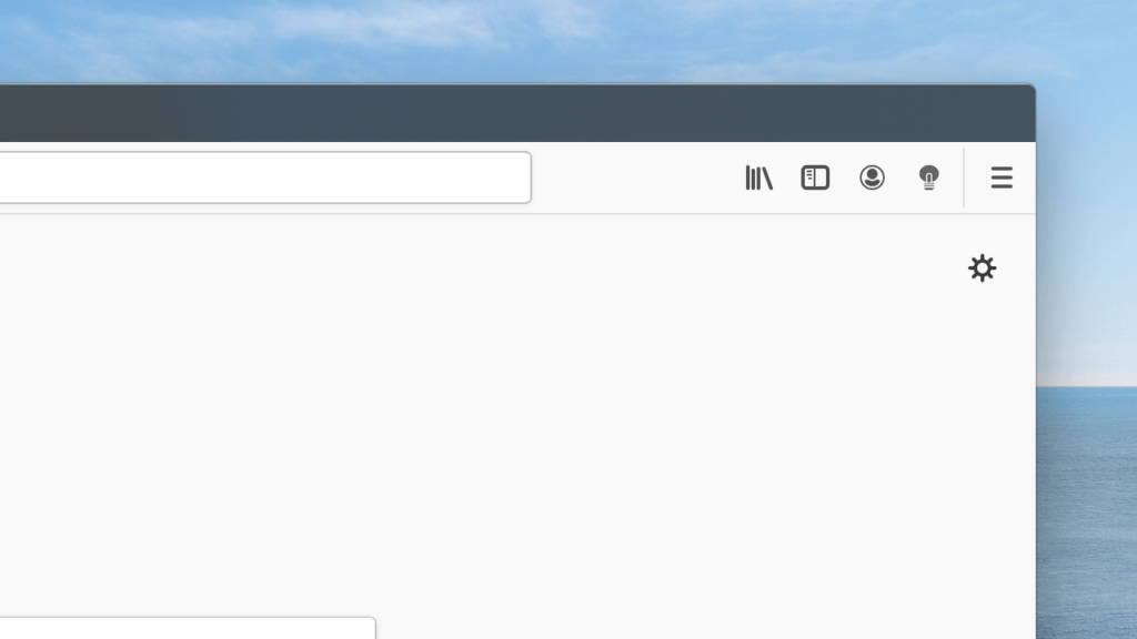
And at last, in the Mozilla Firefox web browser (Windows, Mac, Linux), you will see the newly installed Firefox extension icon just right of your address. No further actions are needed, and you can instantly browse the web in your Firefox web browser. And you can dim the web page from this gray lamp icon in your toolbar.
Now you know where to find your gray lamp icon on all web browsers. So you can dim instantly the current web page with a single click. And if you need any help or assistant with this free and powerful tool. You can get help on the official Turn Off the Lights Support page. And do forget to make a small contribution to continue our Open-Source work and make it available for all users.


